Our invitations are going.
As I was addressing the invitations, I was surprised to see just how far away some of them are headed. Since both Calvin and I grew up in Ohio and currently live in Michigan, I figured that the vast majority of our invitations were headed to those states.
And they are. But they are also going to a lot of other places: 58 cities in 19 states in 3 countries. Closest place is to our home (we addressed one to ourselves!); farthest away is in Ulm, Germany.
Was anyone else surprised to see the places their invitations were going? What's the farthest place your wedding invitations are going?
Showing posts with label invitations. Show all posts
Showing posts with label invitations. Show all posts
Wednesday, March 19, 2008

Monday, March 17, 2008
Invitations - Part 4 - A Happy Ending
Part 1 - Inspiration
Part 2 - Color Crisis
Part 3 - With a Little Help from my Friends
As I mentioned before, I was able to successfully navigate the wedding invitation printing process. Here's the final result:

Opening the envelope

All of the parts and pieces

The return address and response envelope.

And a close up of my favorite part- the response card.
I've gotten lots of positive response about the invitations, and in general, I'm really happy with how they turned out. Overall, I'm happy with having used Overnight Prints for our invitations. I'm really happy with the source of our envelopes, Envelope Mall. And I would definitely order pens (or other art supplies) again from Mister Art.
Part 2 - Color Crisis
Part 3 - With a Little Help from my Friends
As I mentioned before, I was able to successfully navigate the wedding invitation printing process. Here's the final result:

Opening the envelope

All of the parts and pieces

The return address and response envelope.

And a close up of my favorite part- the response card.
I've gotten lots of positive response about the invitations, and in general, I'm really happy with how they turned out. Overall, I'm happy with having used Overnight Prints for our invitations. I'm really happy with the source of our envelopes, Envelope Mall. And I would definitely order pens (or other art supplies) again from Mister Art.
Friday, March 14, 2008
Invitations - Part 3 - With a Little Help from my Friends
Part 1 - Inspiration
Part 2 - Color Crisis
You may recall that I was having some difficulties getting our invitations printed in a nice dark red. In my frustration, I did two things.
First, I decided to visit Papyrus and see what invitations they had that looked nice. We decided if the printing didn't work out, that we might order these:

By Tru Sophistication
But they would be substantially more than our initial invitations. And I'd already purchased our envelopes from Envelope Mall, and it was past the deadline to return them.
So I did what I think any bride who is connected on online forums would do: I contacted a couple of women I'd met. Specifically, Mrs. Emerald, who used a dark red color for her invitations, and Manchmal, a graphic designer and fellow indiebride who has her own invitation design business.
(Note: If you want to print your own invitations using Vistaprint or Overnight prints, but are unsure of actually designing them, you should totally check out Manchmal's etsy shop. She'll pretty much create any invitation for you, and give you the files to print them out yourself. It's awesome.)
With their help, I was able to figure out the problem and resolve it. Basically, Open Office has issues with publishing in CMYK, so that the full spectrum of CMYK colors is not available for use. Including dark red. So as many people had suggested, I downloaded a free trial of Adobe Illustrator.
And victory was mine. Check out how the next test print came out:

Perfectly red. With no indication of hemorrhoids.
I definitely couldn't have done it without the help of Mrs. Emerald and Manchmal. At the risk of sounding really cheesy, I'm really grateful for the ways the internet has connected me with other people.
Where have you found help planning your wedding from online friends?
Part 2 - Color Crisis
You may recall that I was having some difficulties getting our invitations printed in a nice dark red. In my frustration, I did two things.
First, I decided to visit Papyrus and see what invitations they had that looked nice. We decided if the printing didn't work out, that we might order these:

By Tru Sophistication
But they would be substantially more than our initial invitations. And I'd already purchased our envelopes from Envelope Mall, and it was past the deadline to return them.
So I did what I think any bride who is connected on online forums would do: I contacted a couple of women I'd met. Specifically, Mrs. Emerald, who used a dark red color for her invitations, and Manchmal, a graphic designer and fellow indiebride who has her own invitation design business.
(Note: If you want to print your own invitations using Vistaprint or Overnight prints, but are unsure of actually designing them, you should totally check out Manchmal's etsy shop. She'll pretty much create any invitation for you, and give you the files to print them out yourself. It's awesome.)
With their help, I was able to figure out the problem and resolve it. Basically, Open Office has issues with publishing in CMYK, so that the full spectrum of CMYK colors is not available for use. Including dark red. So as many people had suggested, I downloaded a free trial of Adobe Illustrator.
And victory was mine. Check out how the next test print came out:

Perfectly red. With no indication of hemorrhoids.
I definitely couldn't have done it without the help of Mrs. Emerald and Manchmal. At the risk of sounding really cheesy, I'm really grateful for the ways the internet has connected me with other people.
Where have you found help planning your wedding from online friends?
Thursday, March 13, 2008
Invitations - Part 2 - Color Crisis
Part 1 - The Inspiration
I initially used Open Office Draw to design our relatively simple invitations (the screen shots have been edited in paint):

The invitation. Simple, formal, perfect. Designed to be 8.5" by 5.5"

I initially used Open Office Draw to design our relatively simple invitations (the screen shots have been edited in paint):

The invitation. Simple, formal, perfect. Designed to be 8.5" by 5.5"

The response card, inspired by Mrs. Gummi bear's. Calvin really wanted something to demonstrate that would make sure that the invitations didn't feel too "stuffy." Designed to be 5.5" by 4.25"

Business card with the address of our (fairly extensive) website. It was much easier (and cheaper!) to just include that in the invitation than to have several insets with directions and accommodations. Especially since most of the people invited live in Cleveland.
A quick word about the invitation design:
All of the text and images are actually fonts, from dafont.com. We used Tagettes for the text, and Im Fell Flowers letter "P" for the damask-looking watermark. Vegiterra letter "C" provided the carrot image, and LCR on the Farm letter "C" was the chicken image.
Now, I'd heard extensively that offset printing can produce slightly different color results than what appears on the computer monitor, as CMYK (offset printing) colors are different from RGB (computer monitor) colors. We ran a couple of "test prints" with all of the various inkjet and color laser printers we could to test colors, and they came out fine. But just to be on the safe side, I ordered a "test print" of 100 business cards from Overnight Prints. (I know that a lot of people use VistaPrint, but I wanted a matte finish to the cards.) Much cheaper to test print with those than with the whole invitation suite.
This is what we got:

Nice looking, if chocolate brown was our primary color. But it's not. And this is clearly not red.
So I consulted the New Big Book of Color, and changed some things around. And ordered another test print:

This was more reminiscent of hemorrhoids than anything else.
I was frustrated. I was a little bit panicky. And desperate times called for bringing in the reinforcements...

Business card with the address of our (fairly extensive) website. It was much easier (and cheaper!) to just include that in the invitation than to have several insets with directions and accommodations. Especially since most of the people invited live in Cleveland.
A quick word about the invitation design:
All of the text and images are actually fonts, from dafont.com. We used Tagettes for the text, and Im Fell Flowers letter "P" for the damask-looking watermark. Vegiterra letter "C" provided the carrot image, and LCR on the Farm letter "C" was the chicken image.
Now, I'd heard extensively that offset printing can produce slightly different color results than what appears on the computer monitor, as CMYK (offset printing) colors are different from RGB (computer monitor) colors. We ran a couple of "test prints" with all of the various inkjet and color laser printers we could to test colors, and they came out fine. But just to be on the safe side, I ordered a "test print" of 100 business cards from Overnight Prints. (I know that a lot of people use VistaPrint, but I wanted a matte finish to the cards.) Much cheaper to test print with those than with the whole invitation suite.
This is what we got:

Nice looking, if chocolate brown was our primary color. But it's not. And this is clearly not red.
So I consulted the New Big Book of Color, and changed some things around. And ordered another test print:

This was more reminiscent of hemorrhoids than anything else.
I was frustrated. I was a little bit panicky. And desperate times called for bringing in the reinforcements...
Wednesday, March 12, 2008
Invitation - Part 1
When we started looking at invitations, there was one in particular that caught our eye:

Classic and formal, but with a twist: a dark background with with white lettering. From Crane's. Which also means that it was going to be at least $1000 over our invitation budget.
Given that it is extremely difficult to get light text on dark paper, thermography was ruled out. And letterpress was just outside of our budget.
But after seeing Mrs. Emerald's posts about her invitations, I was inspired to do a little designing of my own. And with the Open Office Draw design program available for free, how hard could it be?

A screenshot of the invitation in progress.
Turns out, a whole lot more complicated than I thought. Let's say for now that there is often a reason why things are free...

Classic and formal, but with a twist: a dark background with with white lettering. From Crane's. Which also means that it was going to be at least $1000 over our invitation budget.
Given that it is extremely difficult to get light text on dark paper, thermography was ruled out. And letterpress was just outside of our budget.
But after seeing Mrs. Emerald's posts about her invitations, I was inspired to do a little designing of my own. And with the Open Office Draw design program available for free, how hard could it be?

A screenshot of the invitation in progress.
Turns out, a whole lot more complicated than I thought. Let's say for now that there is often a reason why things are free...
Tuesday, March 11, 2008
They're off!
Yes, these

are off in their hand-canceled glory.
A note about the hand-canceling, as I know that some people have different experiences with it than others.
First, what exactly is hand-canceling, and why do people care about it? Exhibit A below shows a regular postmarked envelope:

Exhibit B is hand cancelled:

Image found here.
In my mind, the hand canceling looks quite a bit nicer.
Now, I'd heard some stories that hand-canceling can be difficult to get. When I was buying my stamps, I spoke with the person behind the counter and he gave me a couple of tips about getting my invitations hand canceled.
The whole conversation went something like this:
Postman: Are you a med school student?
Meg: No, but I'm working on my Ph.D. Why do you ask?
Postman: You are the most confident bride I've ever seen buy stamps, so I figured you must be in medical school. Most brides are very uncertain about their choices and spend awhile trying to sort things out.
(Taking advantage of the good impression I'd made)
Meg: Oh, thanks- I just looked on the USPS website and figured out what stamps I wanted. Do you mind if I ask you a question? Is there any way that it would be possible to get the wedding invitations hand cancelled?
(Postman leans over counter)
Postman (quietly): It's officially against USPS policy to hand cancel regular envelopes. But, I know the person who works the early morning shift on weekdays. If you arrive right after the post office opens, she'll let you did it.
And that is what I did. The post office opened at 7:30 this morning, and I got there at about 7:40. No one was there, and 10 minutes later I'd hand canceled all of the invitations.
Did anyone else try to get their invitations hand canceled? What was your experience?

are off in their hand-canceled glory.
A note about the hand-canceling, as I know that some people have different experiences with it than others.
First, what exactly is hand-canceling, and why do people care about it? Exhibit A below shows a regular postmarked envelope:

Exhibit B is hand cancelled:

Image found here.
In my mind, the hand canceling looks quite a bit nicer.
Now, I'd heard some stories that hand-canceling can be difficult to get. When I was buying my stamps, I spoke with the person behind the counter and he gave me a couple of tips about getting my invitations hand canceled.
The whole conversation went something like this:
Postman: Are you a med school student?
Meg: No, but I'm working on my Ph.D. Why do you ask?
Postman: You are the most confident bride I've ever seen buy stamps, so I figured you must be in medical school. Most brides are very uncertain about their choices and spend awhile trying to sort things out.
(Taking advantage of the good impression I'd made)
Meg: Oh, thanks- I just looked on the USPS website and figured out what stamps I wanted. Do you mind if I ask you a question? Is there any way that it would be possible to get the wedding invitations hand cancelled?
(Postman leans over counter)
Postman (quietly): It's officially against USPS policy to hand cancel regular envelopes. But, I know the person who works the early morning shift on weekdays. If you arrive right after the post office opens, she'll let you did it.
And that is what I did. The post office opened at 7:30 this morning, and I got there at about 7:40. No one was there, and 10 minutes later I'd hand canceled all of the invitations.
Did anyone else try to get their invitations hand canceled? What was your experience?
Friday, March 7, 2008
Stardream vs. the Pen
I'm using Stardream envelopes for my invitations (purchased at the fabulous envelopemall.com).
For those of you that have used Stardream paper, you may be familiar with the fact that it is both difficult to print on and nearly impossible to write on. For those of you that haven't, well, it's difficult to print on and nearly impossible to write on permanently, since it is a coated paper.
I'd decided awhile ago that I would actually hand address all the invitations (and the return address, and the response card envelope- yes, my hand is sore), so I spent some time searching for a pen that would write nicely and permanently on Stardream paper. My usual arsenal of ink pens didn't work, nor did a fine point Sharpie marker.
Stardream 2, Pen 0
Cue the Sakura Glaze Pen:

Designed specifically for non porous surfaces, the ink becomes slightly raised when it dries- like very light embossing. The only trick is that you have to write slowly and let the ink dry before you touch it.
Stardream 2, Pen 100000 (because it totally conquered the Stardream).
The best deal for them that I found was at MisterArt.com, where you can get a two pack for $2.53. I started out with a single two pack in black, but that proved that it was not going to be nearly enough. (Each pen, on average for me, worked for about 65 or so addresses.) But the final result is very nice. (Pictures will be coming next week, after the invitations are sent!)
How did you address your invitations? Did you write them by hand, use a calligrapher or print them?
For those of you that have used Stardream paper, you may be familiar with the fact that it is both difficult to print on and nearly impossible to write on. For those of you that haven't, well, it's difficult to print on and nearly impossible to write on permanently, since it is a coated paper.
I'd decided awhile ago that I would actually hand address all the invitations (and the return address, and the response card envelope- yes, my hand is sore), so I spent some time searching for a pen that would write nicely and permanently on Stardream paper. My usual arsenal of ink pens didn't work, nor did a fine point Sharpie marker.
Stardream 2, Pen 0
Cue the Sakura Glaze Pen:

Designed specifically for non porous surfaces, the ink becomes slightly raised when it dries- like very light embossing. The only trick is that you have to write slowly and let the ink dry before you touch it.
Stardream 2, Pen 100000 (because it totally conquered the Stardream).
The best deal for them that I found was at MisterArt.com, where you can get a two pack for $2.53. I started out with a single two pack in black, but that proved that it was not going to be nearly enough. (Each pen, on average for me, worked for about 65 or so addresses.) But the final result is very nice. (Pictures will be coming next week, after the invitations are sent!)
How did you address your invitations? Did you write them by hand, use a calligrapher or print them?
Friday, February 29, 2008
Color!
In the process of designing our invitations (more on that to come, I promise!), I had some difficulties figuring out colors. I mean, I knew what colors I wanted, but was having a hard time getting what I saw on my computer screen to match with what came from the offset printer.
Cue The New Big Book of Color, which provides numerous designs along with the corresponding RGB (for your computer screen) and CMYK (for offest printing) colors used in the designs.

(available at Amazon)
I spent an hour or so at Barnes and Noble leafing through it, and marking down the RGB and CMYK colors that I thought would work for our invitations. It definitely helped get me on the right track.
What design books have you found helpful while planning your wedding?
Cue The New Big Book of Color, which provides numerous designs along with the corresponding RGB (for your computer screen) and CMYK (for offest printing) colors used in the designs.

(available at Amazon)
I spent an hour or so at Barnes and Noble leafing through it, and marking down the RGB and CMYK colors that I thought would work for our invitations. It definitely helped get me on the right track.
What design books have you found helpful while planning your wedding?
Monday, February 11, 2008
Postage Increase...what should I do?
I just saw that the price of a first class stamp is supposed to increase by one cent to $.42, beginning May 12.
Now, the RSVP date for our invitations is May 1, although the wedding date is after the increase. The most logical solution, of course, would be to use the forever liberty bell stamp.

You, liberty bell forever stamp, are just not interesting enough for my invites.
But I would really like to use some of the much more fun looking $.41 stamps. Like any of these:

Star Wars

Tiffany glass

Flowers
Do you think I should use the forever stamps on the response card envelopes, even though their design is not so cool? Or is there enough time before the postal rate hike to use the prettier, more interesting stamps?
Now, the RSVP date for our invitations is May 1, although the wedding date is after the increase. The most logical solution, of course, would be to use the forever liberty bell stamp.

You, liberty bell forever stamp, are just not interesting enough for my invites.
But I would really like to use some of the much more fun looking $.41 stamps. Like any of these:

Star Wars

Tiffany glass

Flowers
Do you think I should use the forever stamps on the response card envelopes, even though their design is not so cool? Or is there enough time before the postal rate hike to use the prettier, more interesting stamps?
Monday, September 17, 2007
Free Software, part 3
Part 1
Part 2
Today I would like to share with you about another free piece of software: Gimp. While slightly complicated to install- you must first install the GTK+ 2 runtime installer, and then GIMP, it is a pretty powerful program once you have it up and running. More like Photoshop than either OpenOffice Draw or Scribus.
Here is an image of what you see when you open a new document:
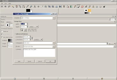
Note how you can very easily change the size of the document and the resolution. You have the option of RGB or grayscale coloring- no CMYK, which is what is preferred for professional printing.
Here is what I get when I hit "OK" to generate the new document:
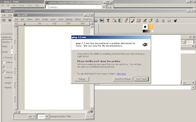
The dreaded error. For some reason, as soon as I open a new document, GIMP crashes. Regardless of the specifications of the document. Now, this may because I haven't installed the program properly, or that I am running an older version of GIMP. I have full faith that when up and running, the program is fantastic, but personally was unsuccessful at getting it running. And I have other programs that suit my needs just fine.
I'm continuing to investigate other free programs that would be useful for wedding planning and life in general. Do you have any others you would like to share?
Part 2
Today I would like to share with you about another free piece of software: Gimp. While slightly complicated to install- you must first install the GTK+ 2 runtime installer, and then GIMP, it is a pretty powerful program once you have it up and running. More like Photoshop than either OpenOffice Draw or Scribus.
Here is an image of what you see when you open a new document:

Note how you can very easily change the size of the document and the resolution. You have the option of RGB or grayscale coloring- no CMYK, which is what is preferred for professional printing.
Here is what I get when I hit "OK" to generate the new document:

The dreaded error. For some reason, as soon as I open a new document, GIMP crashes. Regardless of the specifications of the document. Now, this may because I haven't installed the program properly, or that I am running an older version of GIMP. I have full faith that when up and running, the program is fantastic, but personally was unsuccessful at getting it running. And I have other programs that suit my needs just fine.
I'm continuing to investigate other free programs that would be useful for wedding planning and life in general. Do you have any others you would like to share?
Thursday, September 13, 2007
Free Software, Part 2
Part 1.
I would like to share with you another open source program that I really like: OpenOffice. Like Microsoft Office, only free. In addition to word processing, spreadsheet and database features, the OpenOffice suite also has a really nifty (but basic) design program: OpenOffice Draw. Overnight Prints recommends Draw as one of the programs in which to design postcards. Since we will be printing our invites through them, I thought I'd try it out.
Here's what OpenOffice looks like when you first open the program:

Check out the nifty color feature- you can select colors as CMYK or RGB:

I really like how you can work on the document and see a preview simultaneously:

One of the things I really like about OpenOffice is that it saves the document in the OpenDocument format, which means it can be read by any other program in the OpenOffice Suite. You also have the option of exporting the file as a .pdf, which is fabulous if you want to share it with other people who don't have the program or submit your design to be printed.
(And yes, that is a mock-up of our invitation, which will be discussed in a whole separate series of posts.)
I would like to share with you another open source program that I really like: OpenOffice. Like Microsoft Office, only free. In addition to word processing, spreadsheet and database features, the OpenOffice suite also has a really nifty (but basic) design program: OpenOffice Draw. Overnight Prints recommends Draw as one of the programs in which to design postcards. Since we will be printing our invites through them, I thought I'd try it out.
Here's what OpenOffice looks like when you first open the program:

Check out the nifty color feature- you can select colors as CMYK or RGB:

I really like how you can work on the document and see a preview simultaneously:

One of the things I really like about OpenOffice is that it saves the document in the OpenDocument format, which means it can be read by any other program in the OpenOffice Suite. You also have the option of exporting the file as a .pdf, which is fabulous if you want to share it with other people who don't have the program or submit your design to be printed.
(And yes, that is a mock-up of our invitation, which will be discussed in a whole separate series of posts.)
Wednesday, September 12, 2007
Free Software, part 1
There is a tremendous amount of open source software available on the internet. For those of you who are unaware, open source software is free! Which means if you are looking at dabbling in designing invitations or placecards and don't have InDesign or Adobe Illustrator (or want to splurge on it), you can download a similar program at no cost to you.
Today, I bring to you a design program I have worked with: Scribus. Now, documentation for the program isn't fabulous, but there are plenty of good tutorials available on the web. I'm definitely not the most design savvy individual, but I've been able to figure out some of the very basics of the Scribus without too much trouble. And the benefit is that it is easy to do layouts, when compared to using Microsoft Word.
Here are some screenshots.

A basic document. I changed the dimensions to be the size of our invitation.

What the text editor looks like. It is really easy to edit line by line.

Print preview! You can see the document, as welll as what it looks like.
Now, with all free things, there are some drawbacks. Like I said, documentation isn't necessarily the best. There are some bugs- I've found that the text doesn't always change size/font on the first try. And for some reason, it doesn't really like dingbats all that much.
That said, Calvin and I used it successfully to make a cookbook for our families last Christmas.

Despite those problems, Scribus is free, so it might be worth checking out if you are interested in doing some design work and don't want to pay for a program.
Today, I bring to you a design program I have worked with: Scribus. Now, documentation for the program isn't fabulous, but there are plenty of good tutorials available on the web. I'm definitely not the most design savvy individual, but I've been able to figure out some of the very basics of the Scribus without too much trouble. And the benefit is that it is easy to do layouts, when compared to using Microsoft Word.
Here are some screenshots.

A basic document. I changed the dimensions to be the size of our invitation.

What the text editor looks like. It is really easy to edit line by line.

Print preview! You can see the document, as welll as what it looks like.
Now, with all free things, there are some drawbacks. Like I said, documentation isn't necessarily the best. There are some bugs- I've found that the text doesn't always change size/font on the first try. And for some reason, it doesn't really like dingbats all that much.
That said, Calvin and I used it successfully to make a cookbook for our families last Christmas.

Despite those problems, Scribus is free, so it might be worth checking out if you are interested in doing some design work and don't want to pay for a program.
Wednesday, August 15, 2007
Invitations- they are more than a piece of paper
To follow up last week's post, I continue the discussion of invitations. Perhaps Wednesdays will be a discussion of all things paper?
By June, we still had no idea about invitations, other than that we wanted dark paper with light text. My Gatsby had some good options, with a burgundy paper and silver text. Their Jane invitation would fit into our budget. You could get 125 invitations, complete with response cards, for about $200. But somehow, it lacked that bit of pizazz, that bit of flair. They were, in a word, boring.

Now, I know that they needn't be boring.

But their options for burgundy paper with light text were limited to silver or gold. I really wanted white or light colored text. And Calvin did too.
Cue the opposite of boring: Indian Wedding Card. There is a whole thread on indiebride about ordering through this company, and although there are things to watch out for, there are some amazing deals.
Like these blue ones, for $.85/set, including printing.


These lovely cream colored ones, complete with jewels, for $1.25/set.


Gorgeous deep purple for $.85/set.


Or red with a tassle for $.85/set.

All include printing of two inserts. RSVP cards, thank you cards, and the like are also available. Shipping is expensive- somewhere between $50-$100, but given how cheap the cards are in the first place, it is an extremely good deal.
Unfortunately for Calvin and I, none of the invitations exactly go with the mood/vibe/atmosphere of our wedding and reception, so it was back to the drawing board.
By June, we still had no idea about invitations, other than that we wanted dark paper with light text. My Gatsby had some good options, with a burgundy paper and silver text. Their Jane invitation would fit into our budget. You could get 125 invitations, complete with response cards, for about $200. But somehow, it lacked that bit of pizazz, that bit of flair. They were, in a word, boring.

Now, I know that they needn't be boring.

But their options for burgundy paper with light text were limited to silver or gold. I really wanted white or light colored text. And Calvin did too.
Cue the opposite of boring: Indian Wedding Card. There is a whole thread on indiebride about ordering through this company, and although there are things to watch out for, there are some amazing deals.
Like these blue ones, for $.85/set, including printing.


These lovely cream colored ones, complete with jewels, for $1.25/set.


Gorgeous deep purple for $.85/set.


Or red with a tassle for $.85/set.

All include printing of two inserts. RSVP cards, thank you cards, and the like are also available. Shipping is expensive- somewhere between $50-$100, but given how cheap the cards are in the first place, it is an extremely good deal.
Unfortunately for Calvin and I, none of the invitations exactly go with the mood/vibe/atmosphere of our wedding and reception, so it was back to the drawing board.
Wednesday, August 8, 2007
Invitiations- just a piece of paper?
When this whole wedding business stopped being a discussion between Calvin and I and started becoming reality, Calvin's mom, Mrs. O'Keefe, started suggesting invitation ideas.
This was two weeks after we got engaged. Two weeks! How was I, how were we, supposed to know what type of invitations we wanted? We didn't even know anything else about the wedding at that point in time!
But Mrs. O'Keefe started the wheels turning in my head. Invitations. Huh. We should start thinking about those. At this point, we didn't even have a date. Nonetheless, when we were out shopping at the mall, I brought Calvin in to Papyrus. There was a display board of different types of invitations, one of which were these.

Absolutely beautiful. And awesome. Little did I know that they were engraved invitations from Crane's, which meant that not only were they amazing, they were also freaking expensive. Like sell our first child to pay for them expensive. And wedding invitations are not a priority for us. I love amazing paper as much as the next person, but for us, there are other places that are a bigger priority. Like food, booze and a band.
So then I turned to the next place- Hollander's. Like Paper Source, only better, in many ways. It is independently owned. They make many of their own papers in the basement of the store. Besides, Calvin used to live around the corner from them.
Most importantly of all, they do letterpress printing! And their prices are extremely reasonable- $175 for the custom plate and printing, or $115 if you print them yourself. The paper they recommend you use is Arturo Stationary. The total for 100 invitations, envelopes, response cards and envelopes would end up being roughly $500- they give you a discount (not on their website) if you are printing with more than one plate. And it would be more like $350 if you are local, and are willing to print them yourself.

Which Calvin and I are more than capable of doing.
Unfortunately, not only was the price of the invitations a bit out of our budget, it turns out that letterpress does not work well if you want to have light text on a dark card. The next option, thermography, has the same problems with light and dark. While silver or gold ink would work, there is a part of me that finds it really cheesy. And textured text (either raised or pressed) was really important to me, for some reason. What to do? What to do?
Like anything else, this meant going back to the drawing board, and looking over previously examined places.
This was two weeks after we got engaged. Two weeks! How was I, how were we, supposed to know what type of invitations we wanted? We didn't even know anything else about the wedding at that point in time!
But Mrs. O'Keefe started the wheels turning in my head. Invitations. Huh. We should start thinking about those. At this point, we didn't even have a date. Nonetheless, when we were out shopping at the mall, I brought Calvin in to Papyrus. There was a display board of different types of invitations, one of which were these.

Absolutely beautiful. And awesome. Little did I know that they were engraved invitations from Crane's, which meant that not only were they amazing, they were also freaking expensive. Like sell our first child to pay for them expensive. And wedding invitations are not a priority for us. I love amazing paper as much as the next person, but for us, there are other places that are a bigger priority. Like food, booze and a band.
So then I turned to the next place- Hollander's. Like Paper Source, only better, in many ways. It is independently owned. They make many of their own papers in the basement of the store. Besides, Calvin used to live around the corner from them.
Most importantly of all, they do letterpress printing! And their prices are extremely reasonable- $175 for the custom plate and printing, or $115 if you print them yourself. The paper they recommend you use is Arturo Stationary. The total for 100 invitations, envelopes, response cards and envelopes would end up being roughly $500- they give you a discount (not on their website) if you are printing with more than one plate. And it would be more like $350 if you are local, and are willing to print them yourself.

Which Calvin and I are more than capable of doing.
Unfortunately, not only was the price of the invitations a bit out of our budget, it turns out that letterpress does not work well if you want to have light text on a dark card. The next option, thermography, has the same problems with light and dark. While silver or gold ink would work, there is a part of me that finds it really cheesy. And textured text (either raised or pressed) was really important to me, for some reason. What to do? What to do?
Like anything else, this meant going back to the drawing board, and looking over previously examined places.
Subscribe to:
Posts (Atom)
